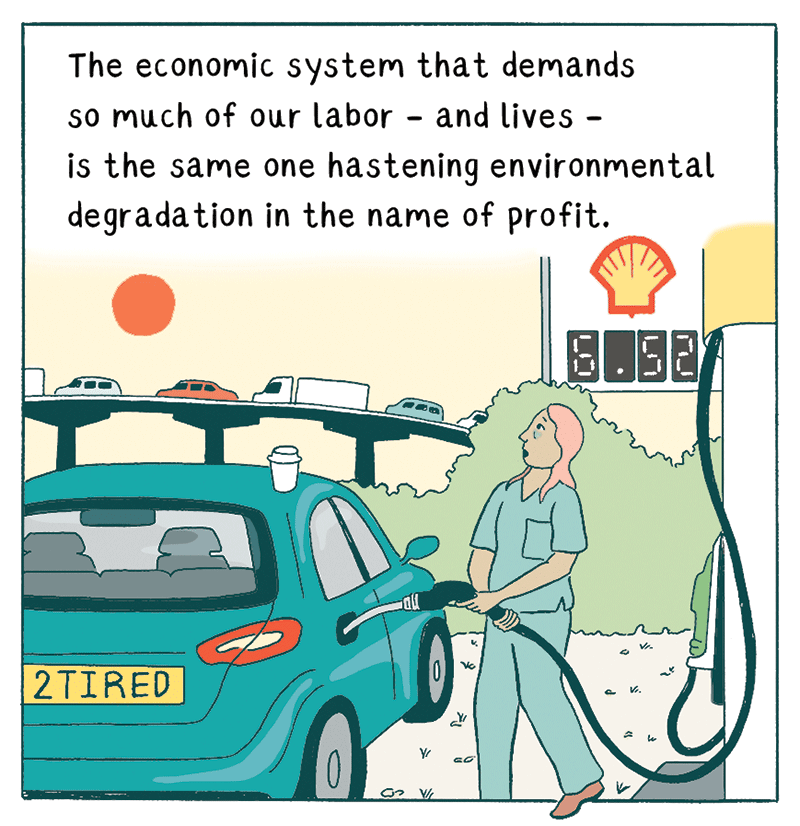
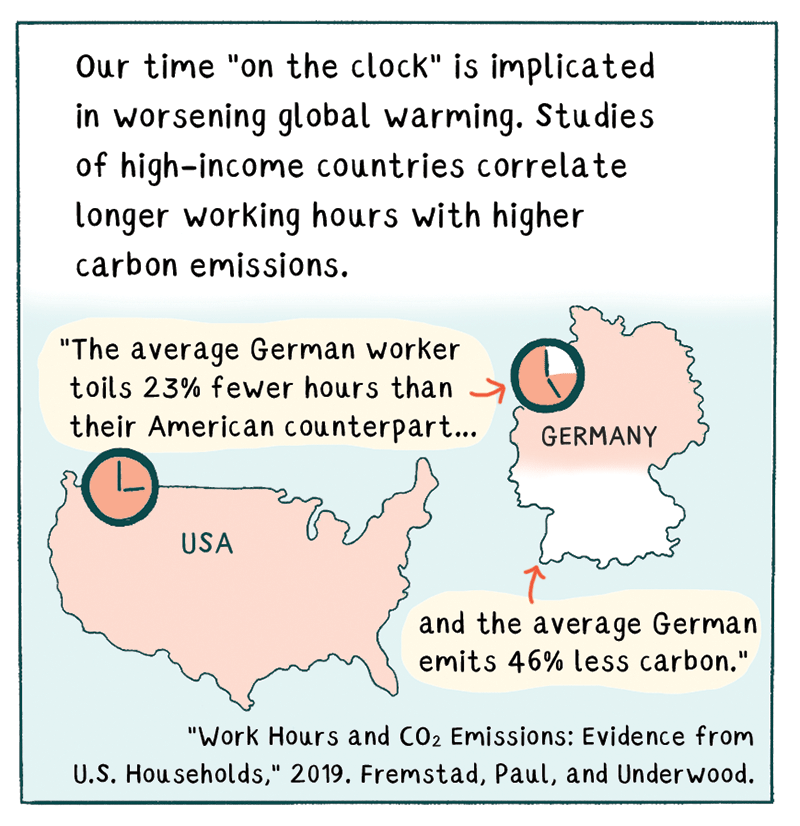
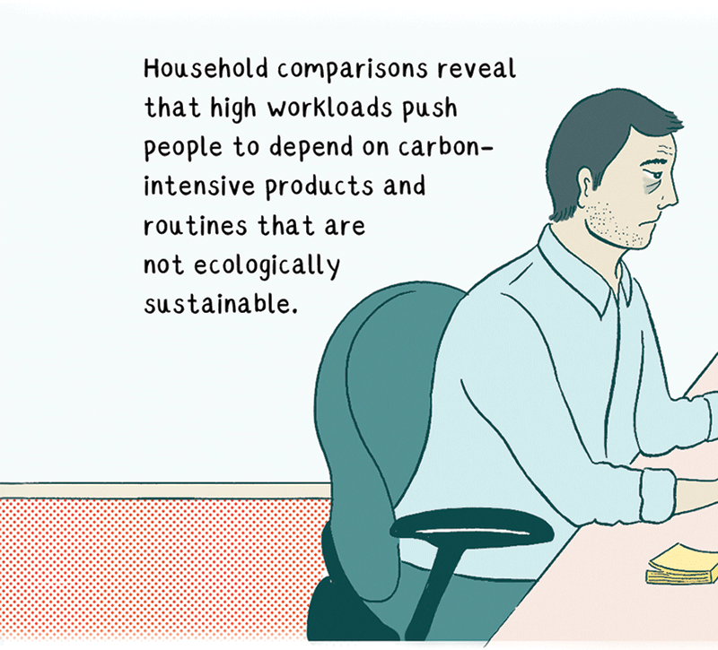
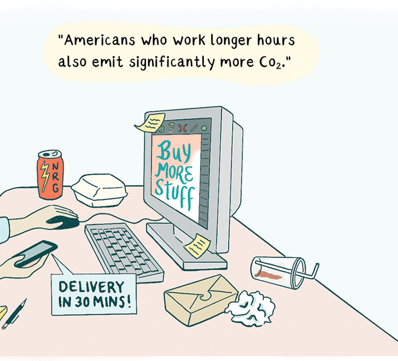
Mouse over elements in the comic to see the clickable areas. They will have hover text, so this site is not mobile-friendly! Clicking these areas will bring up text boxes; these can only be closed by clicking the ×. They do not have to be read in any particular order. The comic analysed herewithin is “Not Working” by Issy Manley, published in The Nib.
To choose which comic I would analyse, I went straight to The Nib. I’ve been reading The Nib for a long time and have followed them on Tumblr (where they crosspost new comics) for years, so I was already quite familiar with it and knew I’d find something I wanted to look at. I only looked at a couple comics on the front page before picking “Not Working” by Issy Manley, because the narrative is complex and educational (and the art style reminded me of what Töpffer says about the simplicity of the image). I picked these panels because I felt they encapsulated well what makes the comic work: the simple graphics, the large amount of text, the symbology, the different styles of panel border, the mix of narrative-casual and scientific voices. Since we’d read it so recently, I wished I could have said more about Unflattening, but I found it difficult, especially since I had a bit of a writer’s block. Instead, I tried to focus on picking some of the most relevant texts and using those as a theoretical springboard, as evidenced by the Works Consulted list. This made it easier to break things down into chunks and see the comic as its components, but I also wanted to give a holistic analysis. I’m not sure I did, but I’m hoping this reflection helps with that.
I chose to analyse my comic on a webpage because I didn’t want to make a PowerPoint, because I hate making PowerPoints that are interactive like this, but I didn’t want to make a physical copy either, because I don’t have access to a very good scanner. I had been working on my website recently and I already knew that adding text popups (modals) to images on click was something that is possible to do in HTML. The comic is already a digital-native format and webpages are naturally suited to that. A webpage is also a very open-source way of doing it because anyone can see the code I used, although it’s quite simple. I think that submitting a live version as well as a static version and a text version is the best route in order to guarantee the best experience. The hover text was a slightly last-minute implementation, but there was no better quick, easy option to indicate where the modals are. I hope it’s not overly confusing or difficult to use—I thought the freely-available text and code would help, and I also thought it would build on the density of comics themselves by adding an extra layer, kind of like a printed comic page covered in Post-Its. The notes don’t have to be read in any specific order either, a sort of deconstruction of sequentiality. I used the most barebones possible text and modal configuration to save time and emphasize the meaning of the text. Getting everything to work exactly the way I wanted it to was a bit frustrating, but viewing the source code will reveal that it is almost completely cruftless!
Sergio Figueiredo. “The Rhetorical Invention of Comics: A Selection of Rodolphe Töpffer’s Late Reflections on Composing Image-Text Narratives.” ImageText, vol. 8.4, https://imagetextjournal.com/the-rhetorical-invention-of-comics-a-selection-of-rodolphe-topffers-late-reflections-on-composing-image-text-narratives/.
Rachel Rys. “Powerful Marginality: Feminist Scholarship through Comics.” Journal of Multimodal Rhetorics, http://journalofmultimodalrhetorics.com/3-1-issue-rys-comic.
Aaron Scott Humphrey and John Carvajal. “Visual and Spatial Language: The Silent Voice of Woodstock.” Composition Studies, vol. 43.1, pp. 19–30, https://www.researchgate.net/publication/330900251_Visual_and_spatial_language_the_silent_voice_of_Woodstock.
Martha Kuhlman. “Design in Comics: Panels and Pages.” Comics Studies: a Guidebook, edited by Charles Hatfield and Bart Beaty et al., Rutgers University Press, 2020, pp. 172–92.
Bobby Kuechenmeister. “Reading Comics Rhetorically: Orality, Literacy, and Hybridity in Comic Narratives.” Scan Journal of Media Arts Culture, http://scan.net.au/scan/journal/display.php?journal_id=132.
Gabriel Sealey-Morris. The Rhetoric of the Paneled Page: Comics and Composition Pedagogy. Composition studies. 2015;43(1):31-50.